During a recent Budget Committee meeting, we discussed the delicate balance between enrollment, institutional financial aid, and net revenue. Inspired by this discussion, I explored the data in our Guilford Factbook put out by the Institutional Research department, and I came up with the following graph which might be helpful in understanding some of our current financial issues. The data I used are the reported tuition and fees, total enrollment (not just entering class size), and the discount rate, or the average amount of tuition we provide as institutional financial aid. From these source data, I derived our average tuition paid per student and our total tuition revenue from all students combined. To make these five variables comparable, I indexed everything to the 2007-08 year, so we’re seeing trends in each variable since that year.
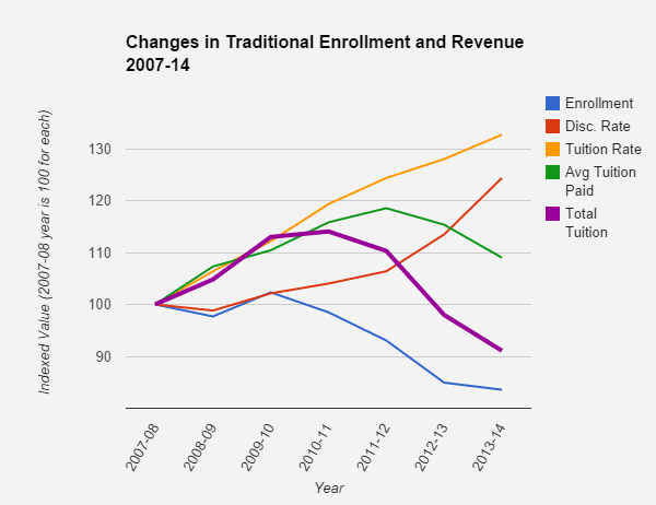
Some observations:
Enrollment (blue line) was stable for the first four years but has dropped in the past three years by about 15%.
Discount rate (red line) has grown with Tuition (orange line). It’s a little tricky to compare these, because the discount rate is a percentage based on the tuition rate, and the tuition rate is a dollar amount, but you can see the trends.
Given the high sticker price of college tuition, ours included, it is unrealistic to think that our discount rate could stay constant with rising tuition, as family incomes are not increasing as fast as tuition has. So, part of the increase in the discount rate is a natural result of tuition increases.
Average Tuition Paid (green line) – this is the combination of the tuition rate and the discount rate, and it reflects how much students pay out of pocket (or borrow in loans). In the fist five years of this graph, the discount rate was growing more slowly than tuition, which meant that the average tuition paid per student rose – students were paying more out of their own pockets year over year. Towards the end of the graph, this falls off, and increases in tuition were more than offset by increases in the discount rate, reducing the amount students paid out of pocket.
Total Tuition (thick purple line) is the result of all the others combined – that is, enrollment times average tuition paid, and average tuition paid is the tuition times one minus the discount rate. We’re off nearly 10% since 2007-08, and we’re down 20% from our high point in 2010-11.
For reference, this Total Tuition value represents about $20 million in revenue out of our total budget of about $50 million, but if you remove the institutional financial aid from the budget (reasonable here because those are circular payments from us to us), it’s more like $20 million out of $30 million. Traditional student tuition and fees fund about 2/3 of the real money we spend.
So what’s the story here?
From 2007/8 to 2010/11, enrollment remained more or less constant. Our tuition rose, and our discount didn’t rise enough to compensate, so students paid us more net tuition each year. That was a good place to be in terms of budgeting.
From 2010/11 to 2013/14, enrollment dropped pretty precipitously, driven by incoming class sizes that didn’t keep pace with graduating class sizes. At the same time, our discount rate picked up significantly, growing from 44% in 2010-11 to 53% last year. This made our income per student drop a lot (although not down to 2007-2008 levels). The combination of these two factors caused our net traditional tuition revenue to drop significantly from 2010/11 to 2013/14.
Note that this is traditional students only and tuition/fees only and doesn’t include CCE or room and board.
Post questions or comments below. If you need a non-color-coded version because of colorblindness, let me know and I can redraft it.