Obviously, a lot is going on at Guilford these days. Some of that has had me looking back at salary figures in response to requests from Guilford allies, so I thought I’d take a moment and provide updates to the comparisons I usually do between Guilford salaries and our traditional peer group, AAUP Category IIB (private liberal arts colleges). This may be my last such update, because as of last Thursday my tenured position at Guilford was terminated effective in May.
This first graph shows Guilford’s reported salary by faculty rank. It’s a little confusing, but the colors are consistent with the ranks. Guilford values are the bigger lines, while peer medians are the thinner dotted lines (the ones that trend upward in parallel and are higher than Guilford’s). The last couple of years have been rough, with nearly no raises. Our gaps to peer medians have grown back to nearly the size of our worst moments back in 2016-17, eating up the significant raise that came in January 2017 with the adoption of the Compensation Plan. This gap is most pronounced at the higher faculty ranks, where decades of low or no raises have produced worse outcomes compared to the relatively recently-hired instructor and assistant pools, which are closer to market salaries. Note that these salary figures are in nominal dollars and are mostly flat over time. If we include cost-of-living increases (i.e. inflation), salaries in real dollars have dropped significantly over the period in question.
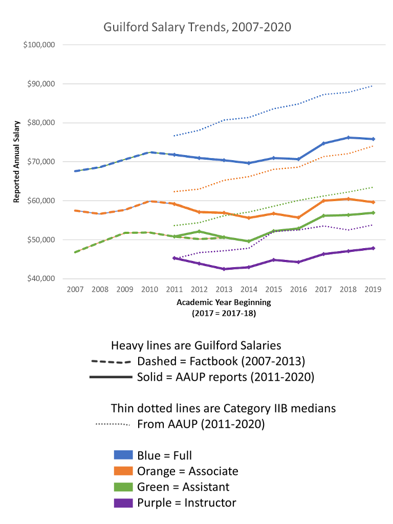
There are two data sources here. One is the college’s Factbook, which used to provide this information every year along with a wealth of other data. That was abolished as the Fernandes presidency began. However, faculty salary data are still reported to AAUP for Guilford and many other institutions as part of standard practice in higher education, so we still have numbers for those. Where the two data sources overlap, the numbers agree perfectly (with the exception of assistant professors in 2012-13).
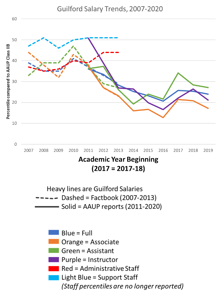
This second graph shows our percentiles within the pool of about 230 category IIB liberal arts colleges that report to AAUP. Unsurprisingly, with no meaningful raises in the past couple of years, retirements of higher-paid colleagues, and very little new hiring, our percentiles at all ranks have dropped nearly down to their low point in 2016-17.
A final note – President Carol Moore recently said in a town hall that this is not the peer group we should use, and that our salaries are in line with North Carolina colleges. She provided this assertion with no support or detail with regard to this set of peers nor with any data, which is typical of her pronouncements whenever comparisons with peers are presented. I find it difficult to believe that our results within North Carolina would be much different from our comparison with national peers.
There was a modest effort in the waning years of the Chabotar presidency from non-academic college administrators to use all private colleges in North Carolina as a peer group. This includes a number of colleges that are nothing like Guilford, e.g. a big number of tiny bible colleges, along with a few high-power ones like Duke and Wake Forest. To me, this seems more an effort to duck responsibility for the poor faculty salary numbers than to address them in a serious way. I do not know if this is the group that Carol purports to be observing, because she provided no detail, but my suspicion is that it might be, because adding a bunch of tiny religious Christian schools drops the median in a way that looking only at liberal arts colleges does not. Given the recent restructuring through massive cuts made nearly entirely without attention to identy but rather on the basis of current enrollment, it is very hard to identify what kind of institution Carol thinks Guilford might be or how she views its identity.
Thanks for posting this, Dave. I miss the Moon Room so much and am glad to see this info here, bad news as it is.